
Chapter 06
Modern Wellness Clinic
North Shore Wellness
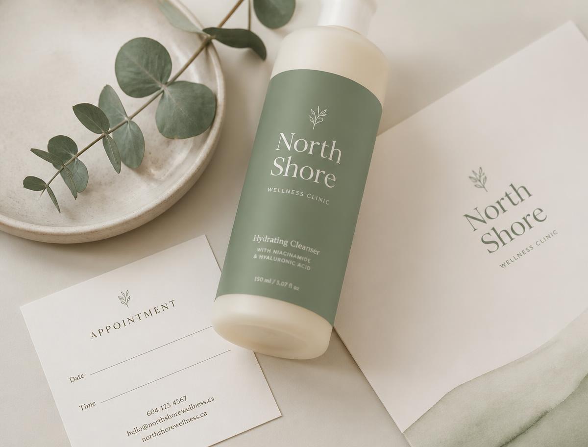
"A calming clinic identity built on sage stillness, airy space, and quiet care."
§ One
The Story
Who we served
Adults seeking integrative wellness — from acupuncture to mental-health coaching — in a space that feels like exhale, not exam.
The challenge
A multi-practitioner clinic whose previous brand looked medical and cold, when the experience inside was warm and unhurried.
The personality
Calm, credible, human — a clinician who listens first and prescribes second.
The direction
Sage neutrals, generous whitespace, quiet typography, and a mark shaped like a leaf mid-breath.
The emotion
The moment your shoulders drop when you sit down in the waiting room.
§ Two
The Foundation
Brand Personality
Calm, credible, gentle.
Brand Voice
Grounded and reassuring — never clinical.
Target Audience
Wellness-focused adults seeking integrative care.
Core Values
Mission
To make care feel like calm, from the first hello to the last visit.
Keywords
§ Three
Visual Identity
A complete logo system built for the shelf, the shop window, the label, and the pocket.
North
Modern Wellness Clinic
Primary Logo
01
NORTH SHORE WELLNESS
Secondary Logo
01
est.
06
Submark
01
Icon
01
NSW
Monogram
01
North
Dark Background
01
Clear Space
Maintain a margin equal to the cap-height of the wordmark on all sides. The mark should breathe.
Minimum Size
Primary logo: 32 px digital / 24 mm print. Submark: 20 px / 14 mm.
§ Four
Color Palette
Primary
Sage
HEX#8FA88C
RGB143, 168, 140
CMYK15, 0, 17, 34
Secondary
Sea Mist
HEX#DDE4D5
RGB221, 228, 213
CMYK3, 0, 7, 11
Accent
Airy Paper
HEX#F5F1E8
RGB245, 241, 232
CMYK0, 2, 5, 4
Accent
Forest Ink
HEX#4B5B4A
RGB75, 91, 74
CMYK18, 0, 19, 64
§ Five
Typography
Heading
GT Alpina
Aa
ABCDEFGHIJKLMNOPQRSTUVWXYZ
abcdefghijklmnopqrstuvwxyz
0 1 2 3 4 5 6 7 8 9
Body
Söhne
Aa
ABCDEFGHIJKLMNOPQRSTUVWXYZ
abcdefghijklmnopqrstuvwxyz
0 1 2 3 4 5 6 7 8 9
Accent
Lowercase serif italic
Aa
ABCDEFGHIJKLMNOPQRSTUVWXYZ
abcdefghijklmnopqrstuvwxyz
0 1 2 3 4 5 6 7 8 9
Specimen
care, quietly considered.
A calm, editorial body sets the pace for reading. Long lines are broken with generous leading, and italics whisper alongside the serif to keep the voice unmistakably North.
§ Six
Photography Style
"Bright soft light, ceramic vessels, botanical stills, hands in consultation, natural textures."
§ Seven
Patterns & Textures
Leaf line-marks
Rounded rule dividers
Sage duotone photography
Sub-mark leaf
§ Eight
Bringing the Brand to Life
The full suite of applications — from the smallest hang-tag to the storefront — carrying one unmistakable voice.
01
Appointment cards
02
Prescription sleeves
03
Reception signage
04
Practitioner name tags
05
Waiting-room wayfinding
06
Wellness journal
07
Sage-glass bottles
08
Website & booking flow
09
Newsletter template
10
Practitioner uniforms
§ Nine
Social Feed
A calm, editorial grid — templates that make posting feel like turning a page.
Calm
"care, quietly considered."
North
Modern
Ch. 06
"Grounded"
§ Ten
Digital
North
Est. 06
care, quietly considered.
A calming clinic identity built on sage stillness, airy space, and quiet care.
North
Chapter 06
care, quietly considered.
§ Eleven
Before & After
Before
NORTH SHORE WELLNESS
Generic sans-serif wordmark, inconsistent color, no supporting system.
After
North
Modern Wellness Clinic
A cohesive editorial system with a mark, palette, and voice.
§ Twelve
Brand Snapshot
Palette
Typography
GT Alpina · Söhne
Voice
Grounded and reassuring — never clinical.
Logo System
Primary · Secondary · Submark · Monogram
Photography
Bright soft light, ceramic vessels, botanical stills, hands in consultation, natural textures.
Applications
10+ touchpoints — from tag to storefront.
Fin.
"Care, at its best, feels less like a visit and more like a breath."
Chapter 06 · North Shore Wellness